Coursera Redesign.

Taking a look at online learning’s biggest pain points.
When online education platforms first became popular, I was ecstatic. I thought, ‘‘This is it! This will redefine education!’’ But time and time again, I saw people attempt to take on an online curriculum and never follow through. There was definitely something in the course-taking process that was making it easy for students to ‘‘drop out’’. And just like any institutional education system, online courses want their drop out rate to be as low as possible. I decided to investigate why online course-takers were turning away—specifically within Coursera’s conversion funnel.

This redesign of Coursera’s mobile app was done over the course of two weeks as part of my Kleiner Perkins Design Fellowship application. The prompt: ‘‘Redesign a feature of a KPCB company’s product’’.

Read the full case study on Medium

A Foreword

I’m always hesitant to commit to a redesign in fear of beating the proverbial dead horse with yet another mobile design in the book Overly White And Punctuated With Bright Gradients. More often than not, I come across unsolicited redesigns that largely lack consideration for developers or heterogeneous user bases. For a change of pace, I’m going to avoid designing purely for aesthetic and focus on more UX-heavy problems that will hopefully make Coursera a more viable product for anyone who considers online learning.

Coursera isn’t new to the game: it was originally founded in 2012, right alongside some of its largest competitors (Udacity, edX). Sadly, its product design still lives in the past, and retains a disappointing and outdated interface compared to the sleeker and more modern Udacity or iTunes U.

I’ll break this case study into three parts:
  1. Identifying the target user audience
  2. Establishing pain points
  3. Presenting my proposed solution

So, Who Uses Coursera?

Coursera’s student body is supposed to be big. Huge, even. With this enormous user base, it is inevitable that there is more than one kind of user intent going into a course. Interestingly enough, users generally find that online learning has visible career benefits, but only 4% of users who start a course go on to actually finish it — a sign that there isn’t ubiquitous interest in course completion — and Coursera knows it.

After reading a lot about Coursera product design and their user base, I decided to cater my redesign to three main user cases:
James
James is a freshman in college and feels like he isn’t as prepared for his classes as he would like to be. He wants to watch some online lectures to supplement his in-person classes without spending too much money on earning certificates.
Sophie
Sophie is a mother of two trying to start a new career path in business. She has no prior experience and an unpredictable schedule but a strong willingness to enroll in paid subscriptions in order to earn certificates or complete online degrees.
Nick
Nick is working at a startup as a product designer. He has some experience in front-end development, but wants to learn more to help with his work. He is not as concerned about certificates as he is about completing advanced courses.
James is a freshman in college and feels like he isn’t as prepared for his classes as he would like to be. He wants to watch some online lectures to supplement his in-person classes without spending too much money on earning certificates.
James
Sophie
Nick
Sophie is a mother of two trying to start a new career path in business. She has no prior experience and an unpredictable schedule but a strong willingness to enroll in paid subscriptions in order to earn certificates or complete online degrees.
Nick is working at a startup as a product designer. He has some experience in front-end development, but wants to learn more to help with his work. He is not as concerned about certificates as he is about completing advanced courses.
Hint: I based these profiles on articles in the links above

Here’s James, Sophie, and Nick. Three users that pretty much cover Coursera’s rather eclectic target user audience: ages 18–55, with various levels of experience and interest in course completion or online degrees.

Personally, I usually look for a specific lecture or learn the basics without getting too involved. I figured there were plenty of other barriers to course completion. But getting rid of full, paid courses isn’t the answer — certificates and degrees still hold a lot of value, especially for users who can’t afford the time or money to attend in-person classes.

Coursera unfortunately appeals primarily to Sophie at the moment. Specializations are promoted as monthly subscriptions, and are advertised as full-length courses with the end goal of obtaining a certificate or degree. This limits the user experience and can be a huge frustration if this isn’t your primary goal.

User Pain Points

After examining Coursera's design at a high level, I did another audit of the designs with the intent of identifying big pain points in the user journey. I realized that most user pain occurred before the user actually commits to a course, and that this leg of the journey could be split in two halves: the path to discover a course, and the course page itself.
Courses & Specializations
The current course page is fairly bulky and doesn’t reveal enough information at the top of the page — allocation of space is not pragmatic and the two interfaces are quite inconsistent. Descriptions are lengthy and (in the case of Specializations) not minimize-able.
Current Course view (left) and Specialization view (right)
If you noticed in the three user cases above, one big disparity between users is payment and willingness to commit to lengthy courses. Coursera is a bit scattered when it comes to showing course options. And by scattered, I mean there are three different ways to see how to enroll in a course.
Two of the three views offer options to enroll or audit the course without paying. The leftmost view offers a one-time course fee, and the two views on the right offer subscription fees per month. None of them are entirely the same. You also can’t see the course price options until you actually open the subscription page. Especially if I’m James, the lack of discoverability or filter for free courses is a huge push factor.
Discover
Course discoverability is also organized so that it’s impossible to differentiate paid-only courses from audit-able courses.
More importantly, there are a number of visual aspects of the “Discover” tab that take up valuable real estate on the screen without providing adequate information:
  • “Catalog” and “Featured” tabs add a secondary navigation that could be eliminated entirely.
  • The starred explanation under “Featured” adds bulk.
  • “Recommended” is visually tight and lifeless. This adds strain on the user to digest information.
In all user cases, there’s trouble sorting through courses.

The Solution

Courses & Specializations
Perhaps the most visible and crucial changes I made were on the course pages. Visual interfaces for both pages are uniform now, and the format accommodates aspects that are unique to each view.

The introduction video in Courses and breakdown in Specializations occupy the same space. Professor information is also still visible in Courses (though its space is reduced greatly).
Redesigns for course view (left) and Specialization view (right)
In both views I cut down descriptions to four lines each. They still rest near the screen’s center, but share the space with the Course or Specialization’s level and price — information that holds great importance but aren’t very visible in the original designs.

Below is a before-after comparison that demonstrates how and why I moved certain elements around:
Changes from the original Specialization page (left) to the redesigned Specialization page (right)

Pricing now indicates whether or not users have the option to access course material for free, a major win for users like James and Nick. Courses generally offer some form of free material, but there are significant differences between “free to audit” and “free to enroll”: auditing a course gives you access to course material whereas auditing limits you to lectures only.

I also changed the page scroll animation that minimizes the title card and adds a smooth feel to the app:

Discover
After taking a look at how courses were displayed across “Recommended” and “Discover”, it felt necessary to redistribute information across the two pages.
Redesigns for “Featured” (left) and “Discover ”(right)
“Discover” is now solely comprised of “Catalog” and the search bar, and I combined “Featured” and “Recommended” into one tab. The left screen also demanded a solution to repetitive text that couldn’t be solved by typographic hierarchy alone, so I placed a full-width carousel on top to grant some dynamism to the composition.

Again, I tried to make discovery more flexible to James and Nick’s liking — instead of “Recommended” taking up an entire page, it is now a single carousel on the new “Featured” page.

If users like Sophie, who really only take classes in one genre, are looking for the old recommended, they can find its full-screen counterpart in “See All”. The new carousel view condenses information yet gives a decent glimpse into each filtered catalog.
The original cell design for specializations (left) with a few minor tweaks (right)
At the moment, only the course cards on “Catalog” look fine (with a few typographic hiccups). I revised these cards to accept longer titles, and to work for both Specializations and Courses.

The goal was to make this element consistent throughout the app as a source of familiarity so that users know where to rest their eyes.

Notice how the creator is aligned to the bottom, with the number of courses sitting right above instead of hanging below the title. This means that the location of course counts are not dependent upon title length anymore.

Photos on course cards also correspond to splash screens on course pages, which gets rid of any buggy aspect ratio issues you might find in the app.

I also added a special carousel to compensate for cutting down on “Recommended” — a list of categories that the user is following, determined in the onboarding process.

Here’s a working demo of the new “Featured” page:
Not shown: a Free To Audit section
The scroll-down above gives you a sneak peak of some sections I’ve broken the page up into.

First, there’s Most Popular:
Courses taken from here
Popular courses aren’t necessarily what users are looking for immediately, but might pique their interest whilst browsing.

This is followed by Categories You Follow as a way to break up the otherwise monotonous grid.
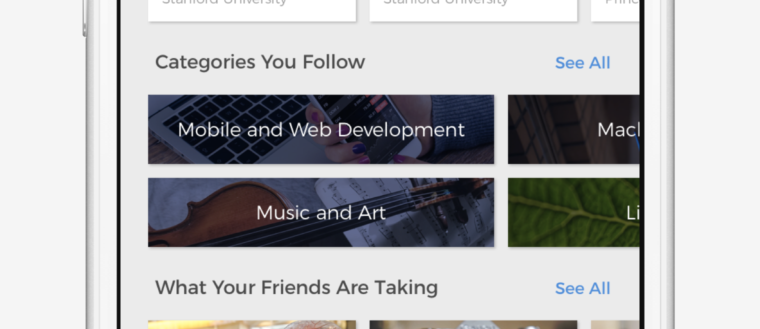
Unlike “Recommended” and “Discover”, Categories You Follow gives users more power to scroll through genres without the tedium of having to browse the actual courses.
Then there’s this. Certainly my most ambitious proposal in terms of backend development, What Your Friends Are Taking puts the Facebook/Google login buttons to use. Coursera could certainly recommend courses to you based on what your friends and contacts are taking, adding an exciting possibility of enrolling in courses alongside people you know.
When you can take courses with friends, online learning becomes more and more like a real classroom.
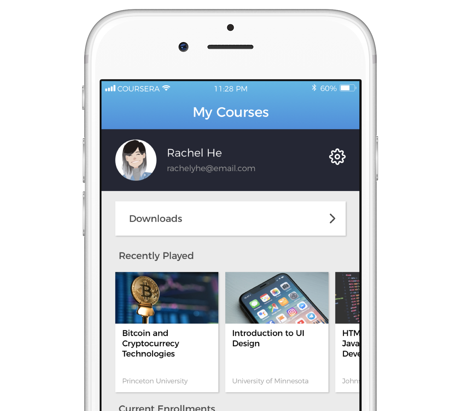
My Courses
As a bonus, I added a Recently Played section on “My Courses” to deal with the following complaint:

It’s been a while since I revisited the class I’m taking, and I need a refresher on some material before I launch into the next section. But it takes some time for me to find the last lecture I watched, and sometimes I can’t even remember which one I opened last.

Students usually take anything between one and four courses, and rarely take five or more. Even with this addition, there’s plenty of space without having an endless rabbit hole of scrolling.
I didn’t spend too much time fiddling with the current profile page…but this was important

Final Thoughts

When I sign up for online learning platforms like Coursera, I always lose interest. My tweaks were an attempt to make the app a more engaging experience and see if I could make visually pleasing yet pragmatic interfaces. However, my design process was conducted without access to Coursera's internal research or design strategy and I'm sure there are parts of the current interface that are specifically designed to meet certain internal metrics.

What I Learned
I started this redesign with the intent of conducting it as a "sprint". With a limited timeframe, I had to rely somewhat on the product's original visual language and not get too caught up with creating new visual motifs or elements. Instead, I focused my time on reorganizing the product instead of reinventing it.

This was also the first project where I extensively used prototyping software. I was introduced to Principle and realized there was a lot more I could communicate through animation than I could through flat screens.

What’s Next?
After completing the two-week sprint I set up for myself, I knew there was more I would want to do if I moved forward with this project. In this case study, my redesigns covered most of the early user journey, before the user enrolls in a course. I imagine that diving deeper into the user experience after enrollment would challenge me to come to new understandings of the product.

I really enjoyed being challenged by this project, and it was constructive to put my design process in writing. Thanks for watching!